简评2010最差的十大游戏封面图
来源: 佚名 2010/12/19 17:26:17 浏览量:578
1. James Bond 007: Blood Stone
Released: Nov 2
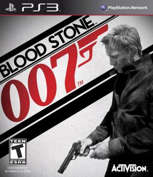
Has the Bond franchise really fallen so far that its boxes have to be assembled from stock photos now? This tells us nothing whatsoever about the game. It doesn’t even look particularly interesting. It just looks like a grimy security photo of Daniel Craig about to rob a convenience store. Or possibly shoot paparazzi for sport.
2. Sengoku Basara: Samurai Heroes
Released: Oct. 12
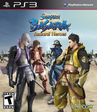
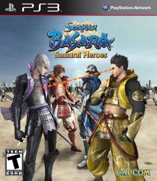
For a game about crazy, over-the-top samurai messing up hordes of other dudes, the US box art for Sengoku Basara is unforgivably bland (especially compared to its dynamic EU counterpart), looking for all the world like the designer just arranged a few pieces of character art on the dullest background they could find and drained as much color as possible. However, that’s not the only thing wrong with it. Check out where those lines of sight are going:
Clearly, there’s more at work here than just a pre-battle psych-out.
3. Sword of the Stars: Complete Collection
Released: May 28
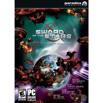
When you first glanced at the above image, could you tell right away those red things were spaceships? Or did it take you a second to realize that they weren’t just twisted masses of rusty crap hanging around in space? The fact that some of you probably still aren’t seeing it makes throwing this one on the pile a no-brainer.
4. Attack of the Movies 3D
Sensory overload isn’t necessarily a bad thing, but there’s just so much going on here that it’s hard to piece together exactly what we’re looking at. The skeleton is clearly making a big deal about how much popcorn it’s vomitinginto that girl’s lap, the shark looks like it’s about to bite into an audience member’s crotch, and we couldn’t even tell that thing in the background was a robot until the fourth or fifth viewing. Just a big fat mess all around, this.
5. Alabama Smith in the Quest of Fate
Released: June 25
There needs to be some kind of moratorium on the “moderately attractive people sort of stand around in the foreground” genre of casual-game art, and this should be the poster child for it. The Leonardo DiCaprio lookalike is amateurishly drawn (and somewhat eerie-looking), the composition’s unappealing and there’s a goddamn inventory menu right there on the box. Never mind that Alabama there seems to be hiding a temple’s worth of miniature antiques on his shirt.
6. Galactic Taz Ball
Released: Aug. 10
For the record, this is Warner Bros’ Tasmanian Devil, aka Taz:
And this is what the makers of Galactic Taz Ball think he looks like:
7. Monster Pals
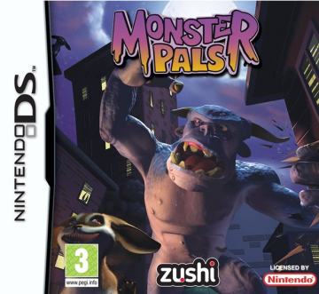
Man, that Zushi logo is really unfortunately placed, isn’t it? Obvious dick-censoring aside, this box tells a story, and that story is that our monster friend there was wandering around drunk at 3 a.m. when that rabbity thing and its friends stole his clothes. If he’s going to save the day, he’s going to have to stumble through the streets, screaming incoherently, until either he can catch the rabbit-creatures or some kid sees him. Seriously, that sounds like it’s probably a better game than whatever this actually is.
8. All Round Hunter
Released: June 25
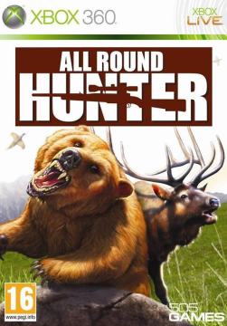
Nothing canruin a hunter’s day faster than two animals from wildly incompatible species putting aside their differences for the sake of justice, which is apparently what’s happened here. They don’t seem to be doing a whole lot aside from that, really, so we suggest the game start being printed under this alternate cover instead.
9. Remington Super Slam Hunting North America
Released: Nov 15
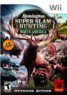
As long as we’re on the topic of nature teaming up to take on hunters, here’s this thing. Holy shit, what a goddamn mess:
10. Kid Fit Island Resort
Released: Oct. 26
This is what you came for, isn’t it? Stuff like this. Horrible, stunted stuff like this, featuring creepy kids with giant heads and soft expressions who can barely lift their arms or make fists. You came to laugh at their pain.
Released: Nov 2
Has the Bond franchise really fallen so far that its boxes have to be assembled from stock photos now? This tells us nothing whatsoever about the game. It doesn’t even look particularly interesting. It just looks like a grimy security photo of Daniel Craig about to rob a convenience store. Or possibly shoot paparazzi for sport.
2. Sengoku Basara: Samurai Heroes
Released: Oct. 12
For a game about crazy, over-the-top samurai messing up hordes of other dudes, the US box art for Sengoku Basara is unforgivably bland (especially compared to its dynamic EU counterpart), looking for all the world like the designer just arranged a few pieces of character art on the dullest background they could find and drained as much color as possible. However, that’s not the only thing wrong with it. Check out where those lines of sight are going:
Clearly, there’s more at work here than just a pre-battle psych-out.
3. Sword of the Stars: Complete Collection
Released: May 28
When you first glanced at the above image, could you tell right away those red things were spaceships? Or did it take you a second to realize that they weren’t just twisted masses of rusty crap hanging around in space? The fact that some of you probably still aren’t seeing it makes throwing this one on the pile a no-brainer.
4. Attack of the Movies 3D

- 应用名称:myweb中文硬盘版 下载地址:https://m.fxxz.com/f/15567
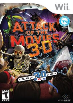
Sensory overload isn’t necessarily a bad thing, but there’s just so much going on here that it’s hard to piece together exactly what we’re looking at. The skeleton is clearly making a big deal about how much popcorn it’s vomitinginto that girl’s lap, the shark looks like it’s about to bite into an audience member’s crotch, and we couldn’t even tell that thing in the background was a robot until the fourth or fifth viewing. Just a big fat mess all around, this.
5. Alabama Smith in the Quest of Fate
Released: June 25
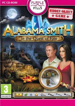
There needs to be some kind of moratorium on the “moderately attractive people sort of stand around in the foreground” genre of casual-game art, and this should be the poster child for it. The Leonardo DiCaprio lookalike is amateurishly drawn (and somewhat eerie-looking), the composition’s unappealing and there’s a goddamn inventory menu right there on the box. Never mind that Alabama there seems to be hiding a temple’s worth of miniature antiques on his shirt.
6. Galactic Taz Ball
Released: Aug. 10
For the record, this is Warner Bros’ Tasmanian Devil, aka Taz:
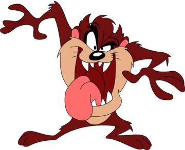
And this is what the makers of Galactic Taz Ball think he looks like:
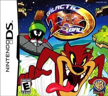
Above: Drawing internationally recognized cartoon characters from memory is always a good ideaThe EU box isn’t exactly great, either, but at least its version of Taz looks like someone made an effort to draw him on-model.
7. Monster Pals
Released: March 12
Man, that Zushi logo is really unfortunately placed, isn’t it? Obvious dick-censoring aside, this box tells a story, and that story is that our monster friend there was wandering around drunk at 3 a.m. when that rabbity thing and its friends stole his clothes. If he’s going to save the day, he’s going to have to stumble through the streets, screaming incoherently, until either he can catch the rabbit-creatures or some kid sees him. Seriously, that sounds like it’s probably a better game than whatever this actually is.
8. All Round Hunter
Released: June 25
Nothing canruin a hunter’s day faster than two animals from wildly incompatible species putting aside their differences for the sake of justice, which is apparently what’s happened here. They don’t seem to be doing a whole lot aside from that, really, so we suggest the game start being printed under this alternate cover instead.
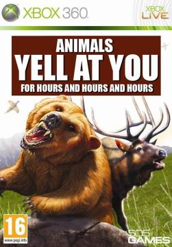
Above: “Hey! Heeeey! Heeyyyy! Heyy! HEEEEEEEYYY! Hey! Heeeey!”
9. Remington Super Slam Hunting North America
Released: Nov 15
As long as we’re on the topic of nature teaming up to take on hunters, here’s this thing. Holy shit, what a goddamn mess:
10. Kid Fit Island Resort
Released: Oct. 26

This is what you came for, isn’t it? Stuff like this. Horrible, stunted stuff like this, featuring creepy kids with giant heads and soft expressions who can barely lift their arms or make fists. You came to laugh at their pain.


